Wednesday, 24 November 2010
Thursday, 18 November 2010
Saturday, 13 November 2010
Program - Finished
This is the installation and opening of the program for the first time.
The animation in the window is not running as it should, I assume this is because of the time lag being created due to the recording of the screen at the same causing my computer to run slowly. I will attach a copy of the video of the installation in this post.
Wednesday, 10 November 2010
Update
I've managed to now complete four of the images, this is a really great step as I feel I've now made some real progress on the final piece.
Below you'll see the four images that are now completed:


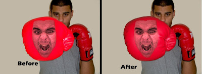
 The image above of the angry fist had to be edited and changed after I received feedback about the glove not looking that realistic and appearing sort of 'Blocky' with the red colour, I managed to get another picture of the glove in the same position and layer it on top of the old one giving a much more realistic look, I still had to edit the glove using the clone stamp tool to remove to brightness of the flash reflecting in the glove but I feel I achieved the desired effect nicely now.
Here is another image of the same picture before and after changes.
Monday, 8 November 2010

Angry face done

After working on the image I have been able to acheive the effect I desired, there will still be a few minor tweeks to be made to this image but on the whole this one is finished.
Monday, 1 November 2010
Gathering Images
Seeing as I've now decided to have there be two different backgrounds for each side of me (Good and bad) I decided that one of the 'Good' backgrounds would be full of technology and the following video is just showing me collecting these images which I plan to scatter around in the background. The other good side of me will be more personal things about me with things like skyscrapers as I come from a very urban town and pictures of my family etc... I'm still decided on what to do for the 'Bad' sides but one of my ideas is to have black clouds in the background with striking lightning, the other one is still undecided upon as yet.
Sunday, 31 October 2010
This is a video I made which is showing the creation of a small basic prototype version of a program I am looking to create to show my animation in, I chose to do this for a few reasons, One, I love technology and I don't feel the animation alone shows that enough, two, its another way of using mixed media :)
Bought the gloves

 I selected these gloves when I went to Sports Direct because the logo was on the top of the glove and the fist part was blank which would enable me to imprint my face onto it in photoshop without disruption.
Sunday, 24 October 2010
Metal Pin Art
I discovered a type of art which I looked into a little bit as I feel it, to an extent, resembles parts of my project.
Metal pin art is where there is a blank board where there is hundreds of metal pins which pop out and give the effect of an protruding image which is a bit like what I'm doing with the face and boxing glove.


More Research on Anthromorphic
I found that the offical word for doing this is called Anthromorphic which comes from the french term 'Anthropomorphe' which means
"Anthropomorphism is the attribution of behavioral or morphological characteristics of other human life forms, objects and even ideas, Refers to a form reminiscent of a human being." - Wikipedia
I found another blog dedicated to images such as this
http://anthropomorphe.blogspot.com/
Thinking about using typography
After looking at examples of previous students work using typography its inspired me to think about using it.
The text which I would be writing I think would be along the lines of
'Peter Jones Vs Peter Jones'
As the idea of my animation is my different sides vs each other.
I've done some research into the layout of posters and adverts promoting fights and I noticed a few reoccurring themes.
The fighters surnames are usually in bold and larger and the first name smaller. Images of the fighters are usually facing each other and the 'Vs' is usually in the middle of both, here are some examples of some posters I found:


I've now thought about having a band across the bottom with the words I want. I'm still thinking whether or not I want to create the letters out of random objects or to use predefined fonts and word art.
I created another rough draft of what it could look like

More on the Boxing Animation Idea
This is a very short video which I made to get a rough idea of how the animation could look. Of course I would try and acquire actual boxing gloves for the real thing and the background would be different.
I particularly liked the way my camera auto-focused onto my fist as it came nearer the lens and blurred out the background, this has given me an idea that when processing the images I will use the 'Blur' tool in photoshop to blur out the background if my camera doesn't do it already.
Tuesday, 19 October 2010
Decision against one image idea leading to others..
I had previously posted about a possible image where by I would use a self-portrait style photograph of myself and then blank out all my facial features and replace the face with several differnt images of my own mouth producing different emotional expression.


However after playing around with the idea on Photoshop I found that the desired effect I had pictured in my head was not possible with my level of skill in photoshop at this time, I also found myself, whilst thinking of the reasons against this idea, formulating another idea.
I found the colouring and the shading on this image would be very difficult to achieve and I was not sure how to do it, however, the thought of shades brought this chain of ideas into my head..
Colour->Shades->Light/Dark->Good/Bad parts of me->Personal pro's and con's->2 Sides, good side and bad side.
This string of ideas gave me an idea to in one image show both sides of me, I then thought about how this could be done using different multimedia which is when I thought of doing an animation formed out of still images of a self-portrait style photo of my head turning from left to right with the detail in the image going from the lighter, good side of me through to the darker not so good side.


I then thought about this idea of one side vs the other side, the word 'Versus' stimulated me to think about my nights events which would be a Boxercise fitness class, I then had this idea pictured in my head

This would basically show an animation of me boxing into the camera and as you look at the boxing gloves they have my face imprinted on, one glove having a happy expression, one a angry one and me in the middle boxing looking neutral.
This idea seems to be the one I'm most serious about so far, whether or not I will make it an animation is another idea, the feasibility of which is yet to be
explored.
The inspiration for the boxing idea came from the album cover for the band 'The Prodigy' and a vague recollection of the album cove for 'Music for a jiltered generation' which showed this
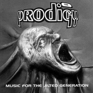%2BMusic%2BFor%2BThe%2BJilted%2BGeneration.jpg)
I liked the way it showed a face pertruding out of a material and thought it would be a good way to show my face coming out of the boxing glove, probably using the embossing feature and changing the colours to match that of the gloves.
Research - J.K. Rowling

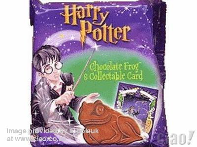
J.K. Rowling is most famously known for the Harry Potter books where by she created seven intertwined complex books depicting a whole new magical parallel world with intricate characters with distinctive personalities and highly descriptive locations and story lines and plots, her mind of which can only be described as 'Genius' by many, including myself.
Her creativity touched many people causing people all over the world of all ages to become enchanted by this magical world she created spurring of films for each of the books and tons of mechanise including things like sweets mentioned in the books such as 'Chocolate Frogs' or 'Berty Botts every flavoured beans'.
Reading this article http://www.showbizspy.com/article/57235/jk-rowling-speaks-out-about-the-depression-that-inspired-her-to-write-harry-potter-books.html really shows how J.K. Rowling was inspired and the processes she went through to write the books
Friday, 15 October 2010

Tuesday, 12 October 2010
Research - Derek Riggs
Derek Riggs was one the main designers of the highly sucessfull British Heavy Metal band, Iron Maiden's album artwork.
He and the other diesigners came up with a reoccuring character whom they placed at the forefront of each album cover who they named Eddi
e. Throughout the differnt albums Eddie looked different depending on the style of the music on the album and the album title.
Derek said that the inspiration for Eddie was because he was sick of the typical 1970's horror charcters and wanted to create a monster that actually looked scary.

The image above was the first album by the band and as the others progressed a reoccuring theme prevailed.
Below is an image of the 'Best of' Iron Maiden with a collage of quite a few of the different Eddies from the artwork of the previous albums.

Throughout his work he made very apparent the bands nationality and partiotism as they were the first proper British Heavy Metal band though having landmarks and subtle hints, for example in the image for the album 'The Trooper', Eddie is seen to be carrying a union jack flag whilst climbing over defeated enemies which could represent Britain conquering enemies.

First Image Done
I put together an image today that I had planned on making which was going to be my head inside a microwave with jail bars over the front. The reasons behind this was that being enclosed within the microwave with bars on represents how I dont like being confined either mentally or physically

Saturday, 9 October 2010
Thinking about things to do..
I've been trying to think of ideas I could use for this first assignment of an 'Interpretive Self Portrait'. So far on my course I've found using photoshop extremely enjoyable so I've been thinking of ideas that could incorporate the new skills I've learnt and allow me to be creative at the same time.
I purchased the sketchbook and started jotting down a few ideas, pictures of which are bellow.
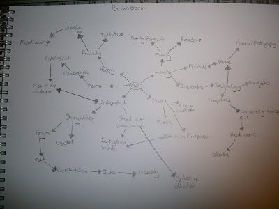
 I had also initially brainstormed 'Myself' and things I associate with myself, from characteristics to interests to perceptions of myself, again, a picture of which is posted below.
Whilst thinking of ideas for another unit project I was storyboarding which gave me another idea which then semi-incorporated 'Film and video' into my project in which I would film a sequence of sorts and then take screen grabs throughout and place them into a blank storyboard to represent how sometimes events in my life seem somewhat surreal and as if I were in the midst of a film.
 What with all of these idea's bursting into my mind I've realised that one single image will not be enough to portray my self portrait therefore I've decided for the moment on creating a collage full of pictures that have been doctored on photoshop, this however is still open to change but for the time being it seems to be the best way forward for myself.
I purchased the sketchbook and started jotting down a few ideas, pictures of which are bellow.
 I had also initially brainstormed 'Myself' and things I associate with myself, from characteristics to interests to perceptions of myself, again, a picture of which is posted below.
Whilst thinking of ideas for another unit project I was storyboarding which gave me another idea which then semi-incorporated 'Film and video' into my project in which I would film a sequence of sorts and then take screen grabs throughout and place them into a blank storyboard to represent how sometimes events in my life seem somewhat surreal and as if I were in the midst of a film.
 What with all of these idea's bursting into my mind I've realised that one single image will not be enough to portray my self portrait therefore I've decided for the moment on creating a collage full of pictures that have been doctored on photoshop, this however is still open to change but for the time being it seems to be the best way forward for myself.
Tuesday, 5 October 2010
Inspiration
Yesterday I needed to get myself out of my flat, I thought I would expolore a bit of portsmouth at night time to see another side of it. I took a walk along by the university library and then up towards Gunwarf Quays, I took my compact camera out with me and took a few photo's along the way and here they are..


This picture reminded me of home and the way where I live you have to be on your guard when walking round at night time and how I felt completely comfortable in Portsmouth at night time.


%2BMusic%2BFor%2BThe%2BJilted%2BGeneration.jpg)
Sunday, 3 October 2010
My older work
A2 Music Video
AS Film Trailer
For my A-Level Media Studies coursework I also had to keep a blog that showed my progress, research and evaluation. Here it is
Subscribe to:
Posts (Atom)